

In Conversation: Stefan Sagmeister

Stefan Sagmeister is an Austrian graphic designer and typographer based in New York. His eye-catching and provocative designs are imprinted in popular culture in the form of album art for many music artists, including Lou Reed, OK Go, The Rolling Stones, Jay Z, Pat Metheny, and Talking Heads. Besides all that jazz, Sagmeister is a well-deserved winner of two Grammys and the National Design Award. He believes that apart from its functionality, design has to be joyous and delightful, which he repeatedly proves in his design, typography, environmental art, conceptual exhibitions, and video installations. When looking at his work, one can’t help but feel like a plastic bag dancing in the wind as Thomas Newman's soundtrack is playing in the background. To simply put it in typography terms, Sagmeister isn’t your boring typeface: he’s BOLD and MODERN, just like his designs, but never REGULAR or OLD STYLE.
KELLY KORZUN: When we’re talking about a general concept of success in the art world, in most cases it’s ultimately connected to the idea of aiming for (a) recognizable work, (b) commercial success, (c) career longevity, and you’ve luckily managed to achieve all of the above. While there’s no lack of information regarding developing a signature style, I find that we don’t talk enough about how to handle it in the long run because once you’ve finally found and heavily employed your trademark, you might find yourself on a path of almost becoming a slave to it. How to break out of this prisoner’s mindset and embrace experimentation without being afraid of betraying something you’ve worked on for so many years?
STEFAN SAGMEISTER: I very much consider myself a designer, not an artist. Back in the day, the slogan of our studio was Style = FART, meaning it's all just hot air and meaningless. Within the design world, I started out trying to employ a different style for every project, but soon realized that it was impossible to achieve without ripping off either a historic stylistic expression or a fellow designer, so I eventually settled on allowing myself to repeat directions with the desire to improve and deepen. Having said that, staying within the same direction requires some stamina, which I didn’t have, so things have changed naturally over time. Today, I just try to do what feels right and fitting, but if I were to give advice to young designers, I wouldn’t worry much about developing a signature style since it’s much more difficult to get rid of than to develop. Whenever I felt stuck in a certain groove, I would turn to Brian Eno’s Oblique Strategies cards, or Edward de Bono’s process suggesting thinking about an idea by taking a random object as a point of departure. For example, I have to design a multi-plug adaptor, but instead of looking at other existing adaptors and researching what consumers would want from this type of product, I start thinking about multi-plug adaptors using a random object surrounding me, say, a rug with fringe. How about designing an adaptor that has six separate plug sockets extending from it (like a spider), as opposed to one piece of plastic where you often have difficulty plugging power cords next to each other? Of course, the reason de Bono’s method works is because it forces the brain to start elsewhere, preventing it from following a familiar pattern.

Invitation card for Sagmeister's first real solo museum show at the MAK (Vienna, Austria)
KK: After your graduation from graphic design school in Vienna in 1986, both Pratt University and The Art Institute of Chicago offered you amazing opportunities, but you ended up picking Pratt because you wanted to study in the number one city in the States, and Chicago was clearly the number two. Not that long ago, you mentioned that had you known everything you know now, picking Chicago would’ve made more sense. What made you realize that? As you’ve been living in NYC for many decades now, which things do you think have improved from a design standpoint, and which ones still leave a lot to be desired?
SS: I would still pick NYC over Chicago any day of the week, every hour of the day, every second of a minute, but I wouldn’t mind spending a couple of hours a week in Chicago. However, I do believe that the school in Chicago would’ve been better as Pratt simply didn’t have a very exciting design program in the 80s. With the exception of faculty members like Tony DiSpigna, Kevin Gatta and Alisa Zamir, the whole place seemed tired, so I simply assumed that The Art Institute of Chicago would have had juicier challenges lined up. As for New York, there are some obvious things that have gotten better over time. Crime went down incredibly, to the point I started enjoying the city the same way I did when I first arrived in 1986. Had the same levels of danger persisted, I don't think I would have stayed here: bumping into people covered in blood in your hallway became old very quickly. Today, the city takes advantage of its waterfronts much better compared to the 80s when they were still largely industrial with very little access to the general public. Bicycle infrastructure has been greatly enhanced, and even really awful places like Penn Station and Laguardia Airport have seen incredible improvements lately.
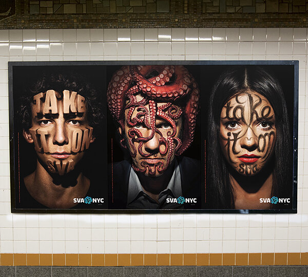
Take It On posters for the School of Visual Arts (SVA) in NYC @Sagmeister & Walsh, 2013
KK: After examining such a fundamental concept as happiness and turning it into a design project, you addressed the concept of beauty. I wanna talk about a person that embodies both of these concepts, and I’m deliberately using a present tense here because the people we love live on as long as we keep the memories alive. The fact that your mother passed away when you were still working on The Happy Film has obviously made it even more challenging, but I’m sure it also led to some sentimental reminiscence. What’s the happiest childhood memory of your mom? In what way do you think the loss of her and your co-director, Hillman Curtis, affected the narrative of the project?
SS: We used to spend all summers in a very simple alpine hut owned by my aunt, with no plumbing, no telephone, and terrible weather. My mom had to work during the week and would only come to Montafon Valley on Sundays, so we would sometimes wait for her car to appear for hours on end, and when it finally did, it was happiness in its purest form. The death of both my mom and Hillman has influenced the project greatly, albeit in very different ways. After my mom died, I also picked up an infection that haunted me all year long, leaving me with very little energy and possibly a true depression that I eventually slowly got out of, so it was a truly terrible year. Hillman’s death influenced the project in a very direct way because he wasn’t around anymore to finish it. If he were still here and in charge, it would’ve been a very different film.

The Happy Film (2016) | Directors: Hillman Curtis, Ben Nabors, Stefan Sagmeister | trailer
KK: You’ve been encouraging designers to send you their work for review on your Instagram for quite a while now. Besides giving back to the design community, another great thing about it is that it’s a two-way street: while they’re learning from you, you’re also learning from them. In one of the design podcasts I listened to, John Maeda pointed out that design is about listening, being agile, changing habits, moving, and not stopping. Do you see this initiative as one of the ways to keep the train moving?
SS: My Instagram project was largely influenced by the late artist Louise Bourgeois who hosted a Sunday afternoon salon where she would have ten artists over at her studio to get their work reviewed, and she was kind enough to critique mine, which has definitely left a lasting impression on me. After literally copying her idea and having ten young designers coming into the studio on Mondays, it became rather impractical, so I switched the whole thing to Instagram. As you pointed out, the energy flows in both directions here – just like it does in every form of teaching.
KK: One of the things that helped you a lot during your career in terms of its longevity is your regular year-long sabbaticals. To quote Mark Rothko, “Many of those who are driven to this life are desperately searching for those pockets of silence where we can root and grow”. Today, there’s more and more people experiencing burnouts, yet, but at the same time we’re very much limited in our choices compared to pre-pandemic times. What advice would you give anyone who wants to revamp or redirect their career today? How would you approach filling these pockets of silence?
SS: Throughout my career, I’ve talked to dozens and dozens of people who took a sabbatical at some point – rich and poor, single people and ones with families, working for giant firms or running small businesses – and every single one of them found that taking a sabbatical was one of the best things they’ve ever done in their lives. Although I’m not in a position to determine what other people should do in current circumstances, what worked best for me in terms of filling these pockets of silence was creating a plan and making a very detailed list of all the things I found interesting, then breaking it down into smaller weekly/hourly periods.

Lecture poster for the AIGA Detroit visualizing the pain that accompanies design projects and incorporating the type cut into Sagmeister’s skin (1999)
KK: According to its official connotation, freedom of speech is a principle that supports the freedom of an individual or a community to articulate their opinions and ideas without fear of retaliation, suppression, or legal sanction. In 2017, you became the subject of controversy after making a sex joke about a manatee at one of your talks, offending the sign language interpreter and upsetting the audience, which you subsequently had to apologize for on your social media. When working on your projects, do you find yourself going through self-censorship even more these days to make sure the visual language and the message it’s trying to convey won’t get distorted?
SS: When it comes to my own work, I pretty much do whatever I want as long as it’s ok with the people I’m working with, but I’ve certainly become more careful when publishing the work of young designers on my Instagram feed in order to avoid creating a potential shit-storm for them.

Album art and packaging design for Lou Reed’s album Set the Twilight Reeling (1996)
KK: One of your main goals as a designer has always been to make design more emotional and more human. For The Beauty Project, you spent a lot of time investigating and researching the role of beauty and its seeming juxtaposition to function. With everything happening in the world right now, will we witness even further acceleration toward digital experiences, or the renaissance of beauty?
SS: We will see both! Digital experiences will have to become much more beautiful (and joyful) to remain successful. For most of humanity, such an extraordinary time spent indoors during lockdowns has resulted in increased importance of the aesthetics of our surroundings. Every business connected to home improvement did well during the pandemic, and even the picture framer across the street from me, on 14th street, said it was by far the most successful year he had in almost 40 years in this business.

Darwin chair prototype utilizing a free swinging structure that includes about 200 sheets of attached prints | @Stefan Sagmeister (2010)
KK: In 2019, you stepped away from commercial work for good to focus on personal projects. To what extent did this shift impact your routine and creative approach? What’s keeping your mind busy these days?
SS: While I still believe commercial work is important and likely has a much bigger impact compared to my other endeavors, I’ve done my share of it and therefore wanted to move on, but I’m still working with numerous designers and collaborators (remotely, of course). As for my daily routine, I now walk up the spiral staircase from my apartment to the studio instead of walking over to Broadway. Overall, my work style remained the same, but the enthusiasm improved because the project on long-term thinking that I’m currently working on seems to be more meaningful, so I end up working longer hours and feeling more satisfied. In a nutshell, short-term media like Twitter and hourly news create an impression that the world is out of control, with democracy in peril, ubiquitous conflicts and the overall outlook of impending doom. However, if we look at developments concerning the world from a long-term perspective, almost any aspect of our life has gotten better: there’s less hunger and deaths in wars and natural disasters, yet more democracy and an obvious increase in life expectancy. Two centuries ago, nine out of ten people could neither read nor write, and now it’s just one out of ten. If we look at the current pandemic from a historical perspective, we’ll see that the Spanish Flu killed 45 million people, and Aids/HIV – about 30 millions. Sure, this does not mitigate the loss of two million (and counting) human lives during Covid-19, but it does put this often cited notion of unprecedented times into perspective. At the moment, I’m working on creating visualizations of these developments hoping that the viewers will want to place them into their living rooms to serve as reminders that all these horrifying tweets were just tiny blips in an overall rather healthy environment. Starting Saturday April 15th, some of these images will be showcased at the Thomas Erben Gallery in New York.
KK: Recently, you shared a handwritten to-do list of your 5-year-old nephew, Samuel, comprising the following steps: (1) Dance (2) Butter croissant (3) Homework (4) Cuddling with Mama (5) Cuddling with Papa. What does Stefan Sagmeister’s to-do list look like these days?
SS: Be mindful of the fact that I am very aware that this is possibly the most boring answer ever: (1) Work on a project related to long-term thinking, which can include anything from a tunnel system for Toronto hospitals to a bike path in Arkansas to preparing the exhibit in Chelsea (2) Virtual dinner over Zoom with friends and food delivered from my favorite Italian restaurant Le Zie (3) Cuddling with my girlfriend.

Woodkid, The Golden Age (2013) © Daniel Sannwald | Paul Simon, Stranger To Stranger (2016) © Chuck Close | David Bowie, The Next Day (2013) © Jonathan Barnbrook | Radiohead, Hail to the Thief (2003) © Stanley Donwood | Korn, The Nothing (2019) © Tension Division
BONUS. Since a huge part of Stefan’s body of work is linked to the music industry, I asked him to rate some album artworks by creating a top-to-bottom list based on his preference:
1. David Bowie, The Next Day. My view might be a bit tainted since Jonathan is a friend. I believe the reuse of the old Heroes cover with the superimposed white square to be brilliant.
2. Woodkid, The Golden Age. It’s always a challenge to create a portrait of the artist that feels fresh. This one does a fine job.
3. Radiohead, Hail to the Thief. There has never been an iconic cover that did not package brilliant music. Had Sgt. Pepper's Lonely Hearts Club Band been designed for any band other than The Beatles, it wouldn’t have gotten that much recognition. This one too became an icon on the strength of the music.
4. Korn, The Nothing. I appreciate that it ignores the visual conventions of metal, but still hate that silly logo.
5. Paul Simon, Stranger To Stranger. While Chuck Close as an amazing artist, and his print show at the Museum of Contemporary Art Australia in Sydney is one of the most impressive feats of skill and process I’ve ever witnessed, I don't feel this enlarged detail from a painting works particularly well as a cover, and the type is a bore.

